Using Google’s CrUX to Compare Your Site’s RUM Data w/ Competitors
For years Real User Measurement (RUM) has been the gold standard for how to measure the performance of web applications. And the reason for it is quite simple: there is no better measure for how users are experiencing your site, than the users’ actual experiences themselves.

Akamai’s mPulse service is one of the more popular commercial RUM offerings, and it’s based on the open source Boomerang library. We implement it by adding some JavaScript to a page (using an asynchronous non-blocking loader) to facilitate the collection of this performance data.
Google’s Chrome User Experience Report
Google CrUX stands for “Chrome User Experience Report”, and it is a new and interesting type of real user measurement data. You do not have to do anything for them to collect the measurement data, and it most likely already has some performance data for your site!
All performance data included in CrUX is from real-world conditions, aggregated from Chrome users who have opted-in to syncing their browsing history and have usage statistic reporting enabled.
The specific elements that Google is sharing are:
- “Origin”, which consists of the protocol and hostname
- Effective Connection Type (4G, 3G, etc)
- Form Factor (desktop, mobile, tablet)
- Percentile Histogram data for First Paint, First Contentful Paint, DOM Content Loaded and onLoad
The CrUX data is made available to query via BigQuery and is also included in PageSpeed Insights reports.
Don’t Have RUM? Now You Do!
In my work at Akamai, I often meet with customers to help them understand and optimize their website’s performance. Sometimes I find myself working with folks that have not used RUM data before. Recently I’ve started creating graphs from Google’s CrUX to show them what RUM data looks like for their sites. For example, the graph below shows the Desktop and Mobile load times for an ecommerce website during March 2018.

CrUX data is specific to Google Chrome browsers – and is reported only from Chrome users who have opted-in to syncing their browsing history and have usage statistic reporting enabled. It’s also a very high level snapshot of 1 month’s data across all pages on the site. But it’s an excellent starting point that you can use to see how your site performs, and compare it to stats that you are using to evaluate your performance. If you decide that RUM data would be beneficial to you then Akamai mPulse has a Lite version that is available for free.
Comparing Akamai mPulse Data to CrUX
This raises some interesting questions:
- How does Google’s CrUX data compare to the data we are already collecting with mPulse?
- Are there ways that Akamai can use CrUX data to add functionality to mPulse?
The histograms I’ve been creating with CrUX are based on the queries used in one of the HTTP Archive’s reports on user experience. The query aggregates metrics based on a bin size of 100ms, and uses a clever JavaScript function to spread the bin sizes when the higher response times are aggregated into larger bin sizes.
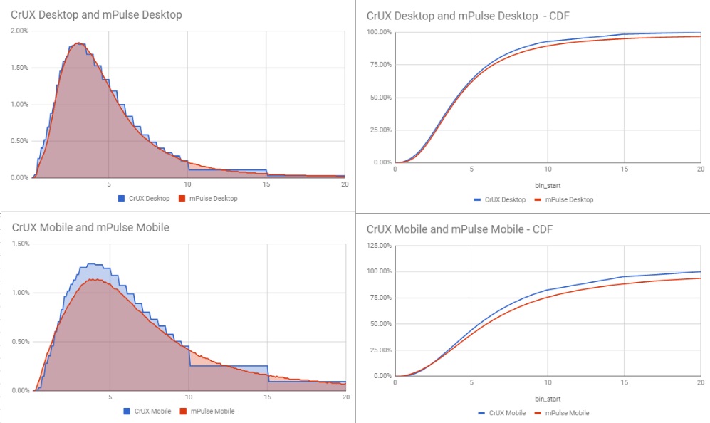
I created a similar % histogram for mPulse and layered them on top of each other. The results are very close.

If we look at the performance for this site across other popular browsers, you can see some variations –

This is just 1 example, but I’ve run this comparison across a number of different sites and can confirm that the CrUX data is accurate when compared to Chrome browsers from RUM data.
How Do You Stack Up Against the Competition?
One area that has always been lacking in RUM is the ability to see a competitive benchmark. Google CrUX changes that though – since it provides everyone the ability to look at the performance of 3 million different sites.
Akamai is working on incorporating CrUX data into mPulse so that customers can easily compare their site’s performance to others. For example, in the graphs below I’ve compared 4 different sites within the same industry. The height of the histograms provides an indications of the distribution of Desktop vs Mobile traffic, and the data aligned to the X axis indicates how their performance compared.

Since CrUX contains dimensions for form_factor and effective_connection_type, we can also compare the relative densities to see the distribution of connection and device types across multiple sites.

I’m really excited to be partnering with Google on this – as it continues to increase the value that mPulse is able to provide our customers.
I Want To Run Some CrUX Queries. Where Do I Start?
Rick Viscomi recently presented a talk titled “Not My RUM”, in which he discussed different ways to query CrUX data. He is also maintaining a really cool repository of CrUX queries, called the “CrUX Cookbook”. Check it out for some examples on how to get started.
This exciting research will be ongoing. For inquiries and to engage on ongoing projects, please contact me at pacalvan@akamai.com. In the next few days I’ll be releasing a video that walks through the process of getting set up w/ CrUX. We’ll start from a new Google account, set up BigQuery, execute a query and then graph the results in Google Docs.
Thanks to Ilya Grigorik, Rick Viscomi and Ellen Li for their help with this.
